KreMail

Directing comprehensive visual upgrades across both the marketing site and full product interfaces, enhancing visual appeal and improving key user journey flows.
Role
Lead Designer
CLIENT
KreMail
AREAS
SaaS Product Design / Website Design / Branding
KreMail

Background

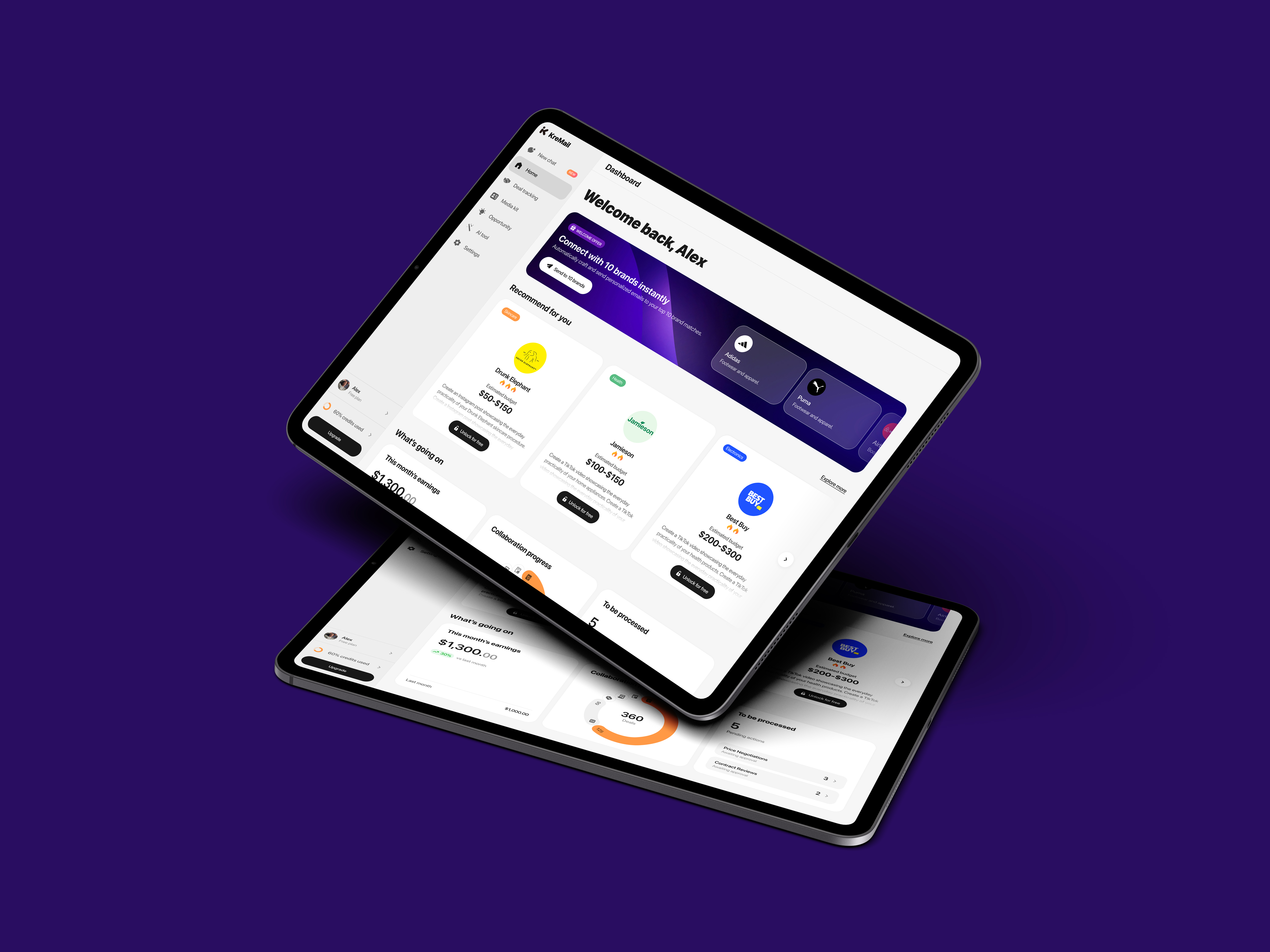
KreMail is an AI-powered media agent that connects creators and brands globally, redefining collaboration through intelligent automation rather than traditional brokers. As a B2C SaaS product, it aims to enhance visual appeal and streamline key user flows to support fast onboarding and frequent use.

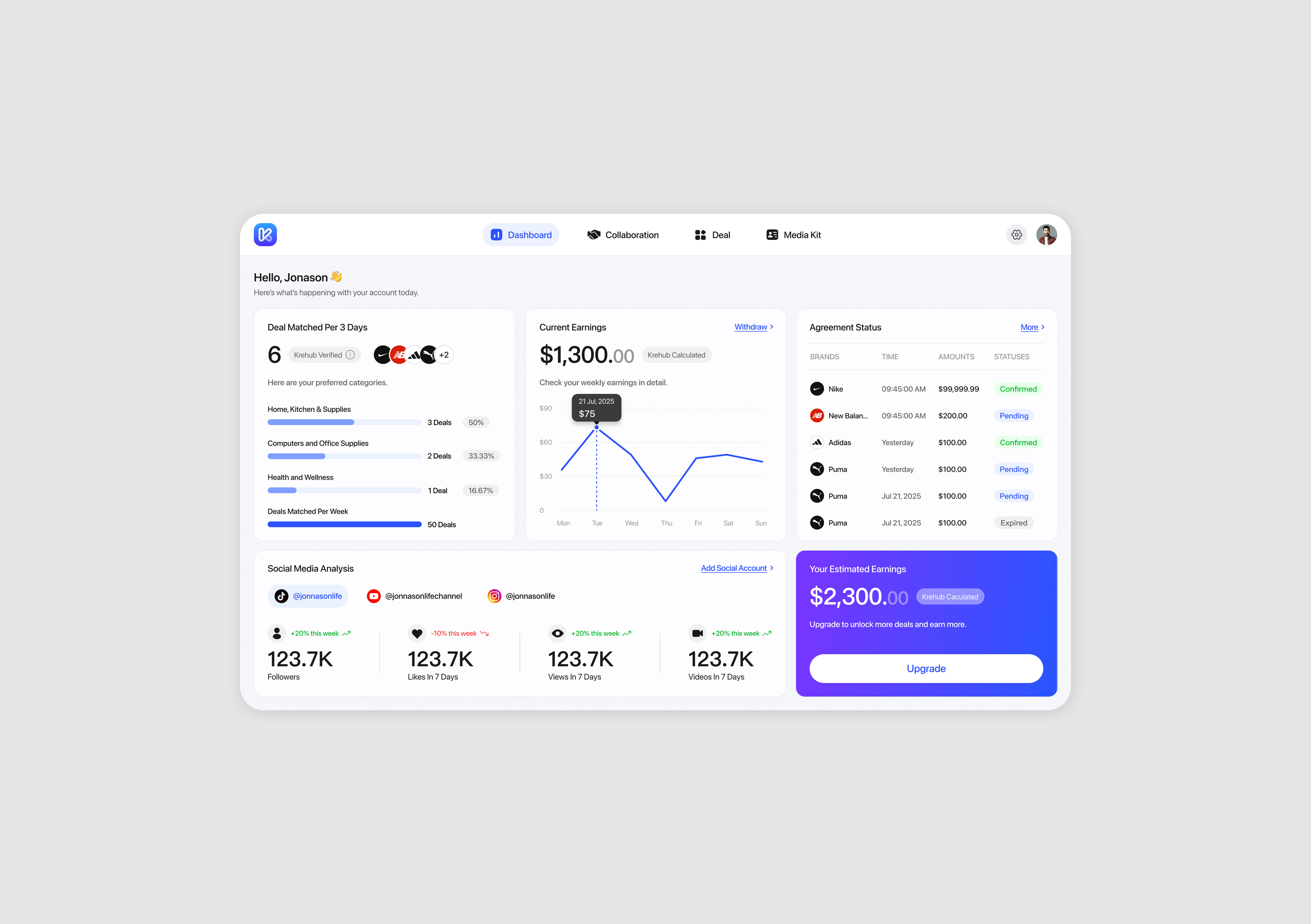
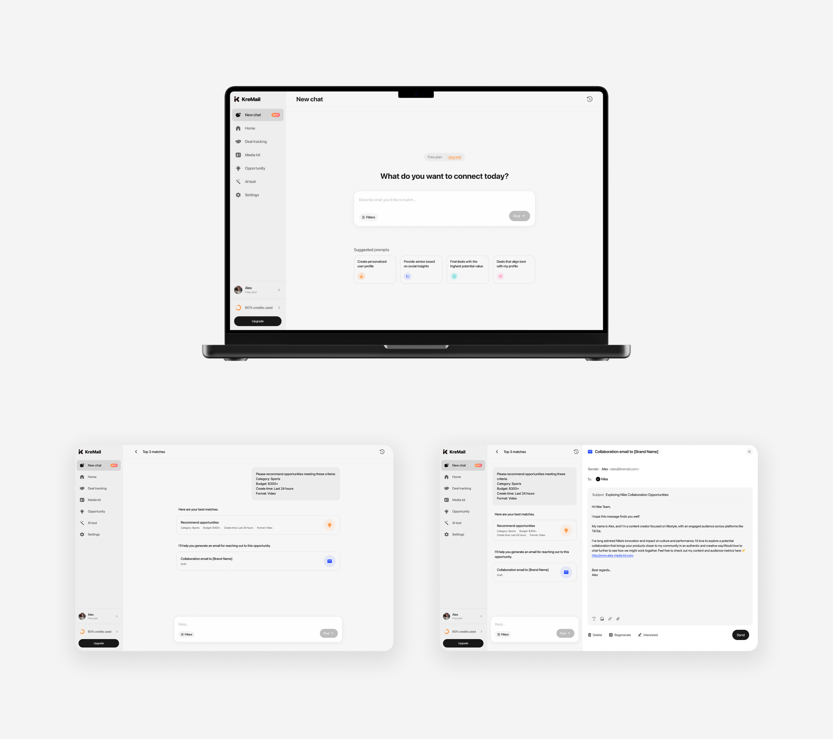
The platform integrates AI capabilities into a chat-based interface, enabling intelligent brand–creator matching and personalized outreach generation, while also supporting additional creative tools within a unified interaction flow.

Given that the primary users are KOLs and creators, the design prioritizes clarity, low cognitive load, and intuitive interaction patterns. My role focused on simplifying workflows, reducing friction in decision-making, and making AI-driven features feel accessible and easy to use.

I joined KreMail at an early stage and contributed to its evolving user experience through continuous iteration. Across multiple incremental updates, Version 3.0 and 4.0 emerged as two key milestones in refining both visual design and usability.

Version 3.0

The original visual identity felt overly corporate for a B2C audience. In Version 3.0, I redesigned the overall visual system and created a new logo to establish a more approachable, creator-friendly brand.

Logo

Logo Loading Animation
Old Version
Version 3.0

Visual System Redesign

⚡️ Structured Information Architecture

Grouped related data into clear modules to reduce clutter and cognitive load, enabling users to quickly identify key insights.

⚡️ Guided User Engagement

Shifted from passive data display to a more guided experience, emphasizing the Media Kit as a core feature to encourage user action and deeper engagement.

⚡️ Optimized Hierarchy & User Flow

Improved visual hierarchy and navigation flow to enhance usability, making the experience more intuitive while increasing feature discoverability and supporting user retention.

Official Website Redesign

Version 4.0

After the Version 3.0 visual redesign, we conducted several rounds of iteration, collecting and synthesizing user feedback to guide further improvements in usability and overall experience.

UX Findings & Insights

⚡️ Limited Feature Discoverability

As a new product, users were not able to quickly grasp the full range of available features, indicating a need for clearer feature exposure and onboarding.

⚡️ Clarity Gaps in Core Interactions

Some basic actions lacked clear guidance, leading to uncertainty during key user flows.

⚡️ Information Clarity in Brand Cards

The content and hierarchy within brand cards were not sufficiently clear, making it harder for users to quickly understand and evaluate opportunities.

Strategy

🌟 Onboarding & Activation

Introduced an onboarding flow to help users quickly understand core features while guiding them to connect their social accounts. This supports early engagement and improves activation and retention.

🌟 Improved Navigation & Feature Visibility

Implemented a sidebar navigation system to clearly surface key functions, reducing the learning curve and making the product structure more predictable.

🌟 Simplified Interactions & Layout Optimization

Streamlined core interaction patterns and refined layout structure to minimize confusion, improving overall usability and task efficiency.

🌟 Enhanced Information Clarity (Brand Cards)

Collaborated with the AI team to improve data extraction, and redesigned the brand cards with clearer hierarchy and richer information display, enabling faster understanding and decision-making.

🌟 Designing for Accessibility & Low Cognitive Load

Considering that many KOL users have diverse educational and digital backgrounds, the experience was optimized to align with their mental models—reducing complexity, lowering the learning barrier, and making interactions more intuitive.

Media Kit Page
Editing Area in Media Kit
Conversational AI Page