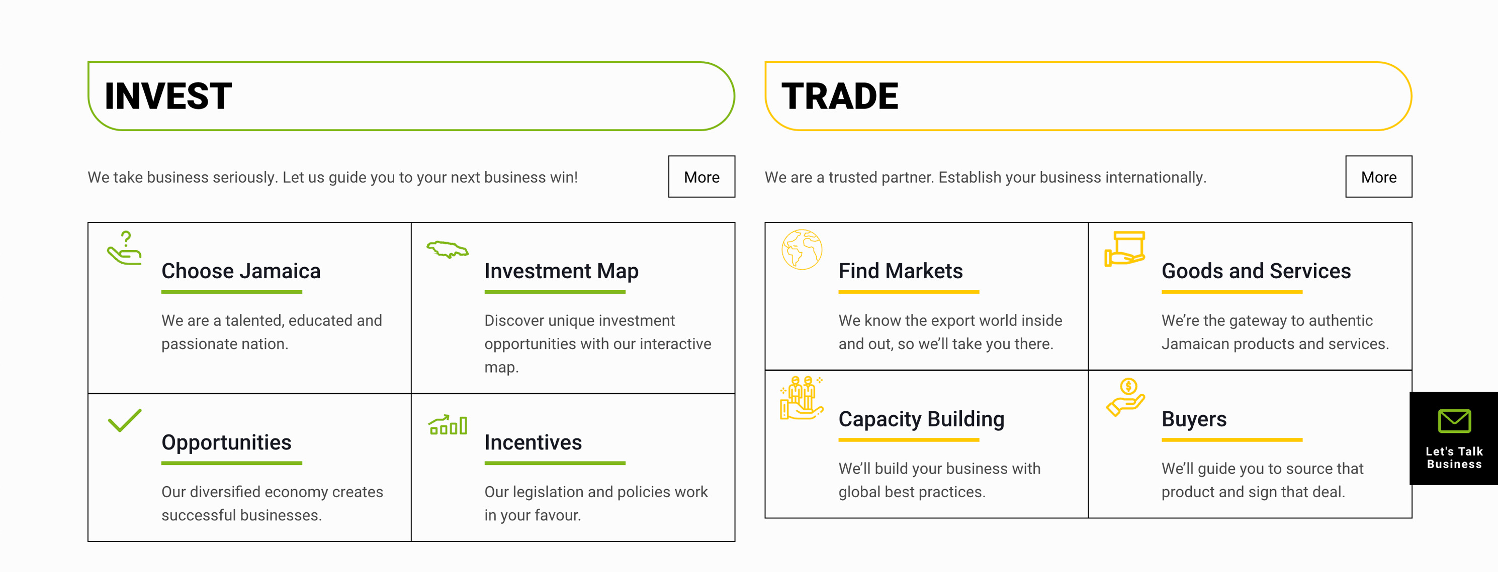
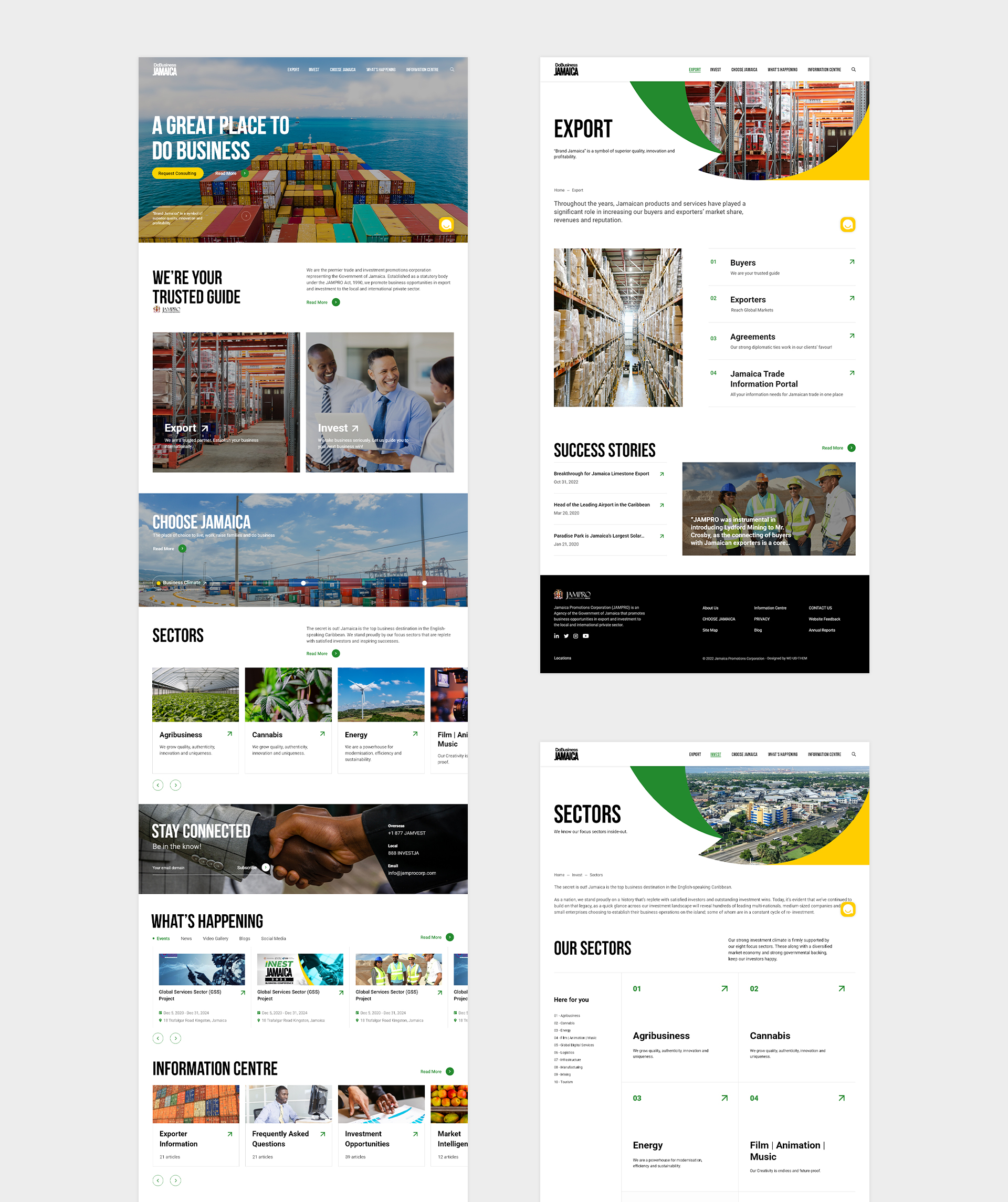
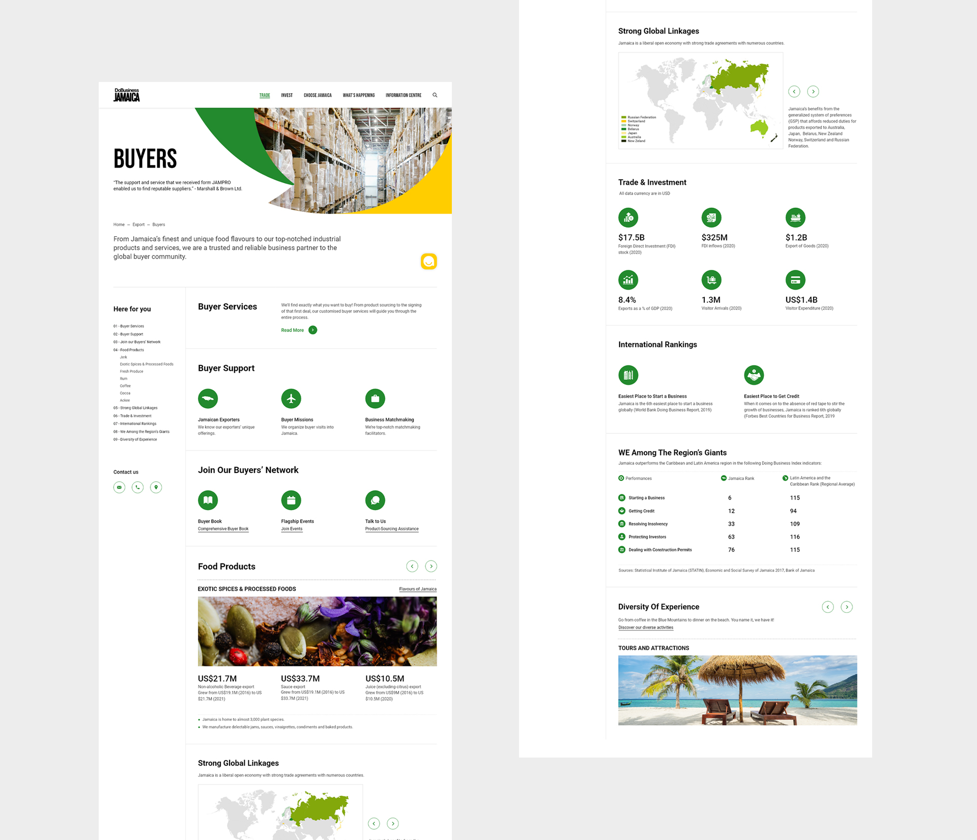
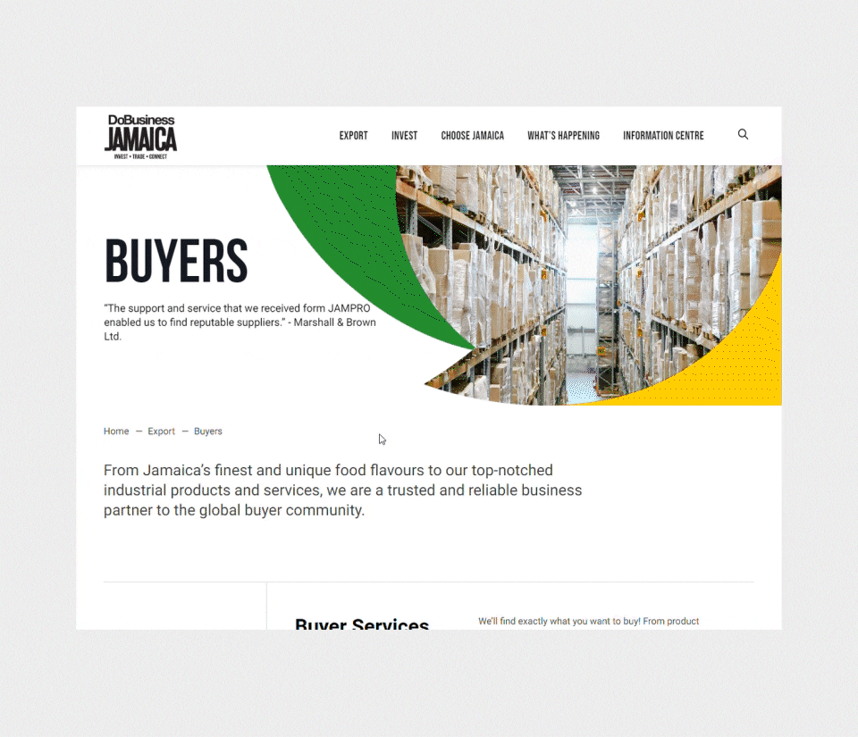
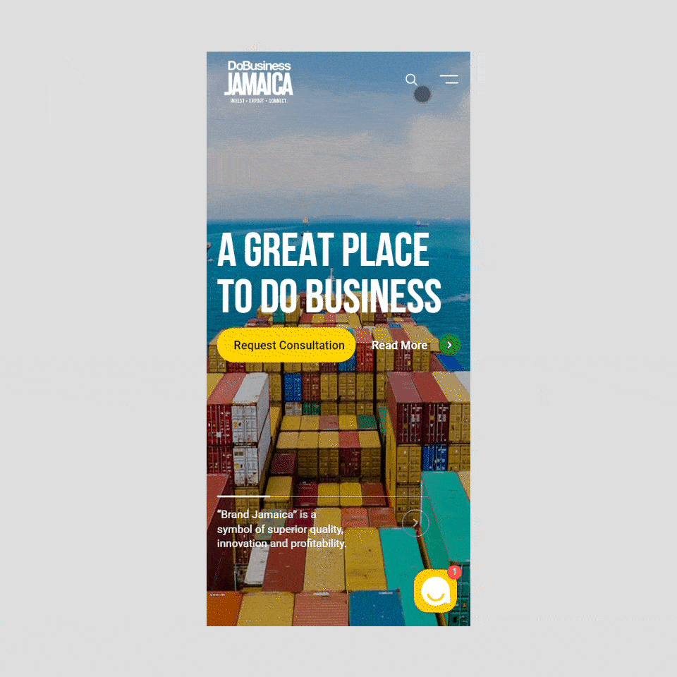
Challenge
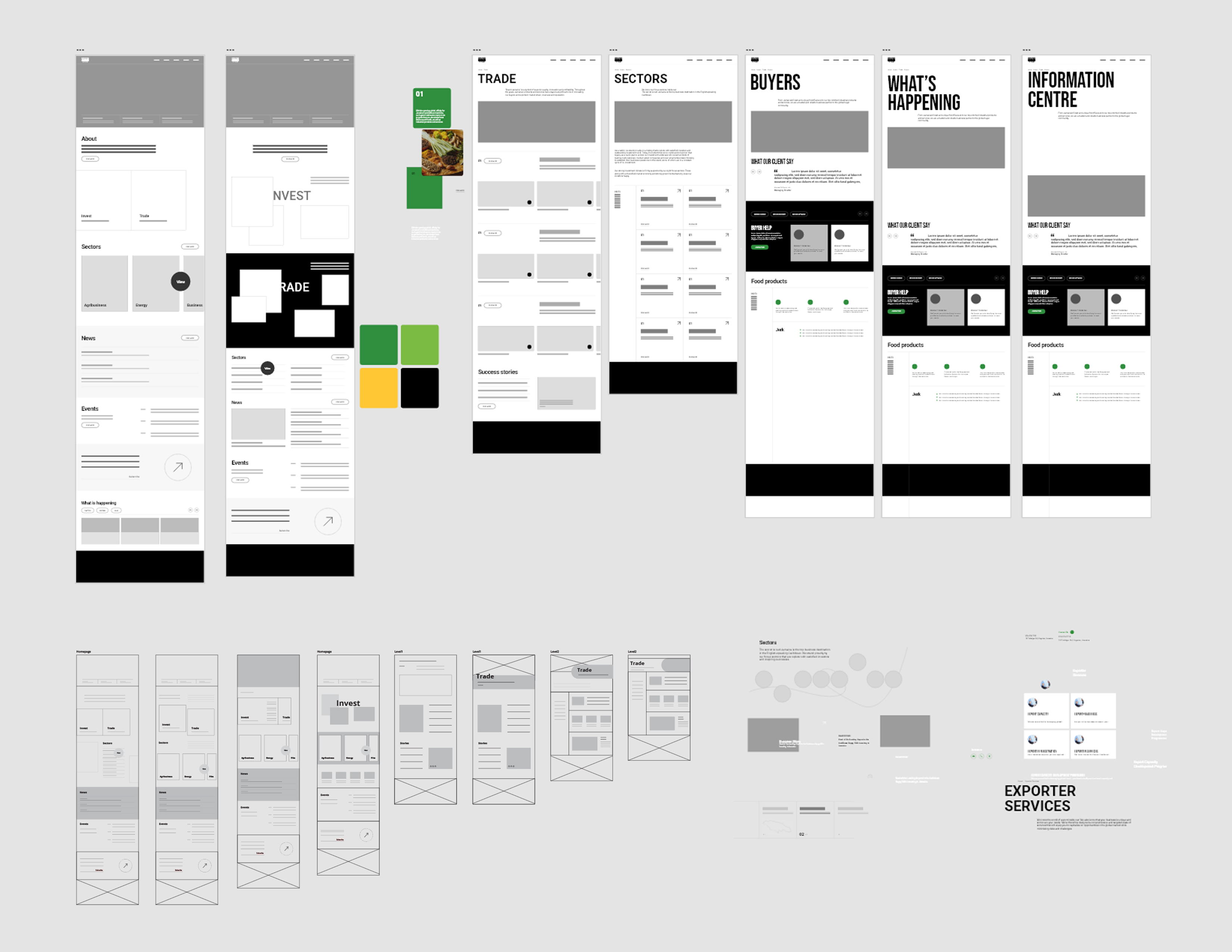
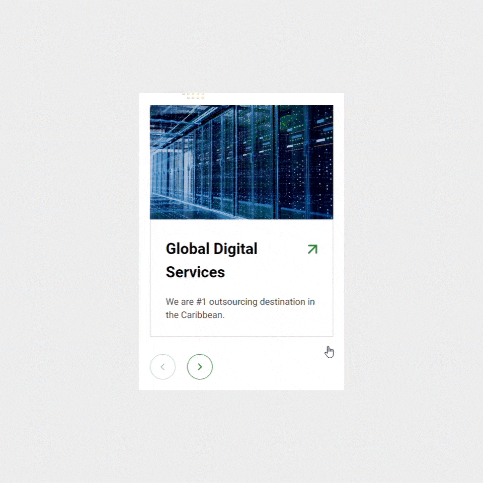
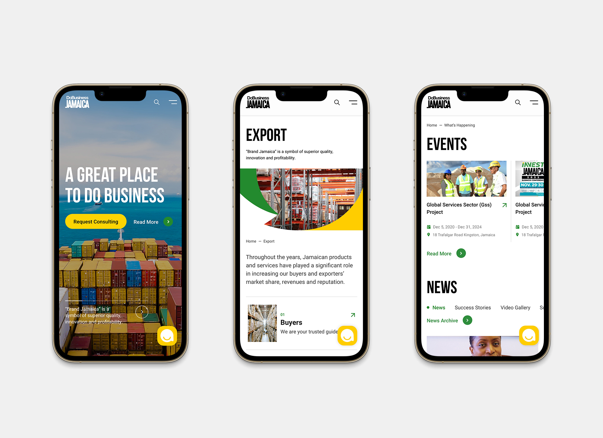
The existing website contained a large volume of information, and the client wanted to include even more content to attract potential investors. However, displaying too much information risks overwhelming users and reducing site usability. To address this, we restructured the website and categorized content using a sidebar navigation system on secondary pages, improving accessibility. We also integrated interactive elements to simplify the process of information discovery and built a full conversion funnel from opportunity exploration to contact.
Another major challenge was cultural alignment. Jamaican cultural expression differs significantly from that of North America. We needed to design a website that aligned with North American user habits while preserving the essence of Jamaican identity. To achieve this, We conducted extensive cultural research to ensure respectful and effective communication.
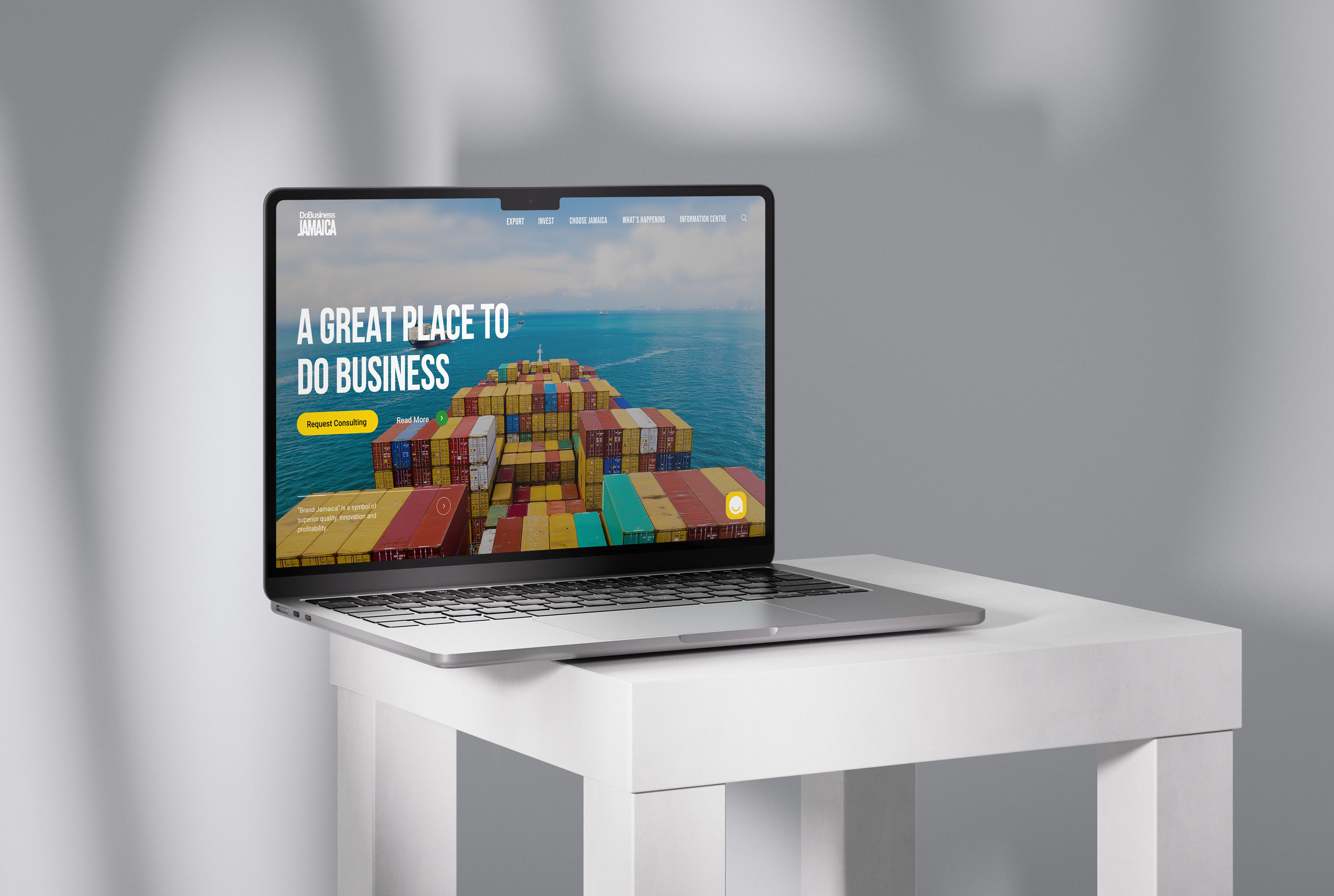
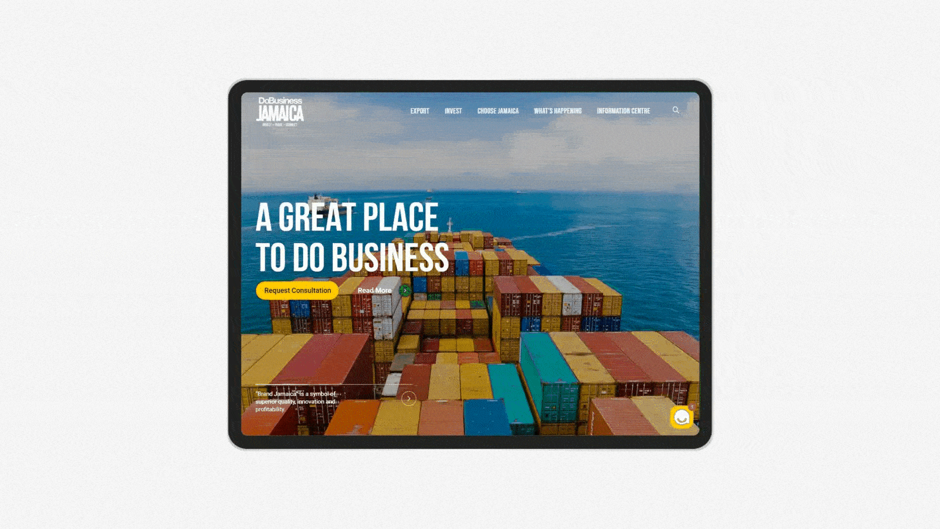
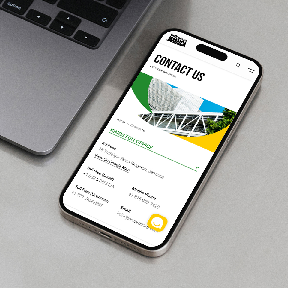
A key client concern was contact accessibility. The existing site had too many contact buttons and links, which created confusion and cluttered the visual experience. Based on user behavior insights, We streamlined the contact interface and integrated an AI chatbot, making communication more intuitive and direct.